

Wayfinding signage is the coordinated system of signs, graphics and environmental cues that helps people understand where they are and how to get to where they need to be. It is more than a set of arrows. A wayfinding system brings together naming, maps, symbols, colours, typography and placement so routes are obvious, decisions feel easy, and movement is safe.
Definition and scope of a wayfinding system
A wayfinding system is a strategy and toolkit that helps visitors quickly form a mental map of a place. In practice, it blends three elements. The first is information design, which covers names, numbering, colours, icons and the rules that keep them consistent. The second is physical signage, including panels, door plates, totems, floor graphics and suspended signs. The third is environmental cues, such as landmarks, lighting, and architectural features, that help people orient themselves without reading.
What are wayfinding systems in real settings? Think of a hospital with colour-coded zones, consistent ward numbers and lift lobbies that look the same on every floor. Or a business park with clear site maps, named blocks and entrance markers that match the directory at the gate. The same logic applies in schools, museums, arenas, stations and offices. Good wayfinding reads the building and the movement patterns, then adds the right information at the right decision points.
The core types of wayfinding signs
Most systems contain four families of messages. Each serves a distinct job, and they work best in combination.
- Directional: Arrows and route markers that guide movement towards destinations or through a sequence of spaces.
- Identification: Signs that confirm where you are, such as a room number, ward name or car park section.
- Informational: Context signs like site maps, directories and timetables that help users plan or re-plan a route.
- Regulatory: Safety, prohibition and instruction signs that describe rules or emergency routes, for example, fire exit signs.
These families overlap in practice. A lift lobby panel might identify the floor, provide directions to key departments and include a fire exit plan. The important point is role clarity. If a sign tries to do everything, it often fails at the thing the user needed at that spot.
How wayfinding signage works
Wayfinding works by reducing uncertainty. It supports the mental steps people take as they move through a place. Those steps follow a pattern. First, users orient themselves by looking for cues, landmarks or a You are Here symbol. Next, they decide on a route using a map, a directory or the first directional sign. Then they follow the path, relying on repeat markers that reassure them the choice still holds. Finally, they confirm arrival with an identification sign.
Behind those steps sit several design choices. Message hierarchy keeps the most important information visible at a glance while less urgent details sit lower down the visual stack. Consistent naming ensures the ward called Birch on the map is also called Birch on doors and in lift callouts. Arrows follow a single style and placement rule so their meaning is never in doubt. Colour coding can help, but only when used sparingly and supported by text and symbols. A corridor with five colours and minimal words is hard to read under pressure.
Placement is a quiet workhorse. People do not hunt for signs when they are already confident; they look for them at decision points. This is where corridors meet, where a staircase splits, where a lobby opens. High up for long sightlines, at eye level for close reading, and ahead of the choice so a route can be chosen early. Confirmation matters too. A small sign at a door that repeats a destination seen 30 metres back provides a steadying effect. Taken together, these details turn a complex environment into a set of simple moves.
Where wayfinding matters
Large hospitals and healthcare campuses rely on wayfinding to keep appointments running smoothly and stress levels low. Universities spread over multiple buildings need to help new students and visitors move between lectures and services without delay. Airports, stations and interchanges are time-critical settings where missed connections can ripple across thousands of journeys. Retail centres and stadiums need walking routes that balance crowd management, dwell time, and safety. Offices with visitors, contractors, and new staff benefit from clear reception points, lifts, toilets, and meeting room identification.
Smaller premises still have wayfinding needs. A nursery with a two entrance layout, a gym with changing rooms upstairs, a clinic with shared corridors and multiple suites. Even simple routes can become confusing during refurbishments, one-way systems or temporary routing changes. The common factor is that the building or site has more than one destination, more than one level, or more than one entrance, and that users have not yet internalised the plan.

Planning a wayfinding strategy
Strong wayfinding starts with a short piece of thinking work before any sign is designed. Begin with a site audit. Walk the likely visitor paths from every entrance and transport arrival point to the main destinations. Watch where people hesitate, backtrack or ask staff. Photograph each decision point and note sightlines, lighting, and any competing messages, such as marketing displays.
Create a simple naming and numbering plan. Decide how areas, floors, and rooms will be identified, and write them down as rules. If floors use numbers, do not interleave letters. If rooms use three-digit codes, keep the pattern consistent so adjacent rooms have adjacent numbers. If zones have names, choose ones that are distinct in sound and spelling to avoid confusion on the phone or via a tannoy. Agree on abbreviations once and stick to them.
Map the decision points and the minimum messages needed at each one. Early messages tend to be broad, for example, “To Outpatients” or “To Car Parks”. As the route progresses, messages become more specific, for example To Room 2.14. Record these in a sign schedule. The schedule serves as the backbone of the system and prevents piecemeal additions that conflict with earlier decisions.
Use sketches or quick mock-ups to test the logic before committing to the budget. A printed temporary panel fixed with low-tack tape in a corridor tells you quickly whether an arrow, a name and a colour are enough. If users still pause, refine the wording or move the panel closer to the true decision point. Only when the strategy works at ground level should it move into design development and production specification.
Design principles for signs people can use
Clarity is the first principle, delivered through plain language, readable type and appropriate contrast. Legibility depends on viewing distance, lighting and font choice. A practical rule of thumb is that a taller letter can be read further away. For long corridor signs, size the x-height so the largest message reads at the point where someone must decide, not halfway past it. Avoid fancy typefaces and use a single family across the system. Mix weights and sizes to create hierarchy rather than swapping fonts.
Contrast helps users of all ages and is vital for partially sighted people. Light text on a dark background or dark text on a light background both work when the luminance contrast is strong, and the finish is low-glare. Glossy panels pick up reflections that hide words. Non-reflective finishes are kinder to readers and to photographs, which often become the informal memory aid for a route.
Arrows must be clear and consistent. Choose a single arrow style and stick with it across all sizes and media. Do not flip the arrow design or swap to a different pictogram at lift lobbies or staircases. The brain relies on pattern recognition, and each deviation adds effort. Pictograms can speed recognition across languages. Use recognised symbols, align them to ISO 7010 sets for safety where relevant and keep them paired with text so users are never asked to guess.
Placement is as important as design. A ceiling-mounted sign can be seen over people’s heads in a crowd, while a wall sign catches attention at eye level in a quiet corridor. Position directional messages before a junction, not at it. Ensure identification is present at the arrival point, not just in the approach signs. Keep clutter under control by removing outdated or duplicated messages. One tidy, accurate panel outperforms three old ones that say almost the same thing.
Accessible wayfinding for blind and partially sighted people
Accessible wayfinding takes into account a wide range of users, including those with visual, hearing, mobility, or cognitive impairments. For blind and partially sighted people, design choices directly impact independence and safety. High-contrast text and symbols, simple language, consistent placement, and non-reflective finishes reduce barriers for many users. Large x-heights and generous spacing improve legibility under stress and in poor light.
Tactile and Braille signs can help at room doors, lift lobbies and key facilities. Photopolymer tactile panels are commonly used in the UK because the raised characters and Braille dots are formed as part of a durable face layer. Where tactile information is provided, follow clear conventions, keep lines short and mount panels at a consistent height so they can be found by touch. Audible cues can also support navigation, for example, lift voice announcements that confirm floor names and stop order.
Accessible wayfinding is backed by duties under the Equality Act 2010, which requires reasonable adjustments to remove barriers to access. British Standard BS 8300 provides detailed guidance on inclusive design for buildings, including signage principles such as contrast, mounting heights and tactile information in appropriate places. Building Regulations Part M also addresses access to and use of buildings. None of these documents turns wayfinding into a rigid prescription, but they do set clear expectations and good practices that designers and building operators should meet.
Include wheelchair users and people with limited reach in the placement plan. Suspended signs create long sightlines, but door identification needs to be within easy reach beside the handle. Keep corridor widths clear so someone using a mobility aid can pause to read without blocking the route. Avoid asking users to bend or reach awkwardly to read a message. The same clarity that helps a partially sighted person will help a parent juggling a pram and a bag. Inclusive design improves the experience for everyone.
Interior versus exterior wayfinding
Inside a building, signs face controlled lighting and weather conditions, but they must work across complex sightlines and varied wall finishes. Materials such as acrylic, aluminium, powder-coated steel, rigid plastics and vinyl graphics are common. Fixings range from standoffs and concealed rails to adhesive pads where the surface allows. Illumination may be ambient, with local lighting planned to avoid glare on glossy surfaces.
Outside, materials must resist UV, rain, wind loads, pollution, and accidental impacts. Aluminium and aluminium composite panels, powder-coated steel totems, vitreous enamel and toughened glass may all be specified depending on the site. Reflective or illuminated details can help where routes operate at night. Foundations and fixings need to account for wind uplift and ground conditions, and local planning permission may be required for larger structures. The design language should remain consistent so that external markers, car park sections and building entrance identifiers feel like they belong to the same family as the internal signs.
Transition points deserve care. A visitor moving from a car park to a reception door is experiencing changes in light levels, noise, and walking speed. A site map at the car park exit sets direction. Reassurance markers between the car park and front door confirm the route. An identification sign on the building and a reception marker remove the last doubt. When those pieces line up, the experience feels simple even if the site is large.

Digital wayfinding and hybrid systems
Digital tools do not replace physical signage; they complement it. Interactive kiosks and digital directories can provide search capabilities, preferred route options, estimated walk times, and temporary changes, such as lifts being out of service. QR codes can link to mobile maps that update as the building changes. Screens can show dynamic content at peak times, for example, directing spectators to quieter turnstiles or pointing shoppers to available parking levels.
A hybrid system works best when the digital and static elements share the same names, colours and symbols. A visitor who sees Ward Elm on a kiosk should find Ward Elm on corridor signs and on the door. Governance matters. Someone has to own the content, apply agreed naming rules and ensure changes roll through every channel, from a vinyl panel to a kiosk database. Without that, digital becomes another competing voice instead of a helpful one.
Cost and complexity vary. A single kiosk in a large lobby may be enough for a public building with strong static signage. A campus with frequent changes might benefit from a simple mobile map that keeps pace with work and moves. Choose the smallest digital tool that meets the user’s needs and support it with clear, fixed signs so the route works when phones run out of battery or screens are busy.
Compliance and UK standards that affect wayfinding
The UK does not have a single law that governs every aspect of general wayfinding. There are, however, clear regulations and standards that apply to parts of a system, especially safety and accessibility. For safety messages and emergency routes, the Health and Safety, Safety Signs and Signals Regulations 1996 apply. These implement a European directive and point to harmonised symbols. In practice, most UK workplaces adopt ISO 7010 pictograms for safety signs, ensuring meanings are standard and recognisable at a glance.
Fire safety signage is part of a building’s fire precautions. The Regulatory Reform (Fire Safety) Order 2005 sets out duties for the responsible person, supported by government guidance, including signage for escape routes, firefighting equipment, and assembly points. Exit signs are typically green and white, with the running man pictogram and a directional arrow, in line with standards. They must be positioned so every escape route is clear and unambiguous. Photoluminescent materials may be used in certain settings to enhance visibility in low light, but they do not eliminate the need for proper emergency lighting where required.
Accessibility is covered by the Equality Act 2010 and supported by BS 8300 and Building Regulations Part M, both of which provide guidance on signage for inclusive environments. These address matters such as tactile information at room doors, luminance contrast on text and symbols, and consistent mounting heights. Sector codes also exist. Healthcare premises, railways, airports and schools often have additional, specific guidance issued by relevant bodies.
A final note on permissions. External signs may require advertisement consent or planning permission, depending on size, illumination and location. This sits outside the wayfinding design logic but is a practical part of delivering a compliant scheme. Where your wayfinding touches regulated safety information, align your design language sensitively rather than trying to rebrand a mandatory symbol. If you need compliant fire exit symbols, assembly point boards or mandatory notices, our page on health and safety signs explains the options and standards in more detail. See our health and safety signs page for details:
Testing and improving wayfinding usability
Usability testing turns a good plan into a proven system. The aim is simple, check whether real users can get where they need to go, in a reasonable time, without help and with low stress. Begin before production by testing logic with temporary boards and printed arrows. Then, once permanent signs are installed, test again to see how the whole environment performs at real size and speed.
Effective methods include:
- Task trials: Give people unfamiliar with the site a route to complete and time their journey, while observing any hesitations or detours.
- Intercept interviews: Ask visitors at key points how confident they feel, where they last checked a sign and what wording they are following.
- Lost visitor logs: Ask reception and security to log requests for directions by destination, then review repeated trouble spots.
- Heat and flow observations: Watch movement at peak times to confirm that signs are visible above crowds and at the right angle of approach.
- Map comprehension checks: Show a site map and ask users to point to their current location and the intended destination to confirm orientation.
Keep the testing lightweight but regular. Run a check after any refurbishment, move or rebrand. Small tweaks, like moving a panel one metre nearer a junction, can halve uncertainty. Treat the sign schedule as a living record that changes when the building changes. A wayfinding system is only as good as its maintenance.
Lifespan and maintenance of wayfinding signs
There is no single lifespan for a wayfinding sign. Materials, environment and the rate of change in your building all play a part. Internal rigid panels made from aluminium, acrylic or high-grade plastics can remain serviceable for many years if the information they carry stays up to date and the surfaces are maintained.
Vinyl graphics on walls, windows and floors tend to have shorter lifespans. Adhesives and printed inks age, and floors, in particular, see heavy wear that can limit their lifespan to months or a couple of years, depending on product choice, traffic, and cleaning regimes.
External signs face UV light, rain, temperature swings and physical knocks. Powder-coated aluminium and aluminium composite panels usually offer strong durability when correctly specified and installed. The printed faces, if used, may need to be renewed before the structure does.
Totems and post-mounted signs withstand weather well with the right finish and fixings, but colours can dull in strong sun over many seasons. Illumination brings its own maintenance needs. LED systems are long-lasting compared to older lamps, yet power supplies and diffusers still benefit from periodic checks and cleaning.
Changes in information can drive updates before materials wear out. New departments, room renumbering, fresh branding, or a refurbished level often mean a new face or a new panel, while the frame remains. Build this into your plan from the start.
Choose modular systems where possible, so inserts or faces can be updated without replacing the whole sign. Schedule cleaning for internal and external signs. Dust, fingerprints and algae hide messages and reduce perceived quality. A maintained system communicates care and competence as much as directions.
Customer experience gains from effective wayfinding
Clear wayfinding lowers effort for visitors and staff. People arrive calmer, on time and with more attention to spare for the reason they came. That helps clinical teams run clinics to schedule, helps venues start events on time and helps offices welcome guests who are ready for a meeting rather than flustered by the final corridor. The same clarity also reduces the number of times receptionists and ward clerks are pulled away from their core tasks to give directions.
In retail and leisure, wayfinding supports dwell in the right areas and reduces empty wandering in the wrong ones. Shoppers find facilities easily and return to their cars without stress. Museums and galleries can balance flows through popular exhibits and minimise bottlenecks. Brand perception benefits too. A system that looks like it belongs, uses the right tone and works without fuss sends a strong signal about care and attention. The opposite is also true. Mixed fonts, taped over arrows, and missing confirmation signs say the building is hard work. Users notice the difference even if they cannot name it.
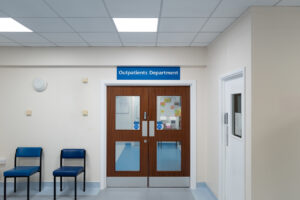
Reducing lost visitors and wasted time
A well-designed wayfinding system reduces lost visitors by reducing opportunities for wrong decisions. The first tool is clear orientation at the start of a journey. A large, simple site map with a You are Here marker and a small number of obvious routes pays for itself in reduced confusion. The second is an early, unambiguous direction at each fork. The third is confirmation messages spaced where doubts typically creep in. When these pieces line up, people no longer need to stop and ask.
The knock-on effects are practical. Reception queues shrink at pinch points where the only question was Where X Security teams spend less time escorting people to the right entrance. Staff who used to act as impromptu signposts can attend to their job. In clinics with time-based appointments, fewer lost patients means timelier starts and less pressure on clinicians. The improvements are small in isolation but material across a day or a week.
Common mistakes and how to avoid them
Many wayfinding problems start with good intentions and grow over time. Adding new signs without a plan leads to contradictory messages. A corridor acquires five arrows in two styles, pointing in three directions. Users then slow down to make sense of the noise. Avoid this by keeping a current sign schedule and removing old messages when new ones appear.
Inconsistent naming forces users to translate. If a map says “Imaging” and a door says “Radiology,” some will assume they are different. Pick one name and keep it everywhere, noting an alternative on the map if clinically useful. Colour coding can overpromise. Seven different colours across a small building ask too much of the human memory. Use colour to group high-level zones, not to mark every minor destination.
Contrast and finish are easy to miss. A stylish grey-on-grey panel in a bright lobby may look refined in a photograph but unreadable at arm’s length. Test colours and finishes in the space’s natural light. Mount signs so they are visible in a crowd. A beautiful wall panel at 1.6 metres is useless behind a queue of people the same height. In busy spots, consider projecting or suspended signage that sits above heads. Finally, do not forget confirmation at the destination. It is odd how often a route is well marked, then the door at the end has no identification.
Safety signage within the wayfinding system
Regulatory messages form part of a complete wayfinding picture. Fire exit signs, assembly point boards, first aid points and mandatory notices do not simply sit beside the system, they are integrated at the right points along a route. Their appearance is not a design free-for-all. Standard colours and pictograms ensure fast recognition in a crisis, and their placement should be consistent along every escape path. Respect these rules while aligning other elements, such as typography, spacing, and fixings, with your wider system so the result feels coherent.
Think about safety and wayfinding together during planning. A visitor following a route through a building should see the same clarity on the escape signage if an alarm sounds. If you are updating escape routes or replacing mandatory boards at the same time as wider-premises signage, we can help you match the design intent while remaining compliant. For more on the regulated elements themselves, see our health and safety signs page, which explains the main sign types, symbols and placement for UK workplaces.
Discuss your wayfinding and safety signage
Warrington Signs designs, produces and installs clear, practical signage for interiors and exteriors. We work across Warrington and the North West. If you are planning a wayfinding refresh or introducing new departments, we can help you agree on names, plan routes and specify materials that fit your building and budget.
If your project includes fire exits, first aid points, or mandatory notices, our team can advise on the regulatory requirements and supply compliant boards alongside your directional and identification signs. Tell us about your building, your visitors and the changes you have coming up. We will help you turn that into a usable sign schedule and a reliable system.
To get started, contact our team. We offer our sign-making services across the North West, including Manchester, Liverpool, Wigan, and St Helens.